
Histogram Construction and Data Distribution Demo
2014-08-27 19:04
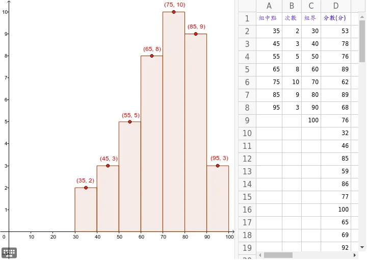
This applet demonstrates how to use the Histogram command in GeoGebra to plot the frequency distribution of a dataset. By inputting a data list and class boundaries, users can generate a frequency distribution histogram that visually displays the statistical characteristics and distribution pattern of the data. The applet allows students to enter their own data sets and define class intervals, observing in real time how the histogram updates to reflect the chosen parameters. This hands-on interaction helps learners understand the relationship between raw data, class boundaries, bin widths, and the resulting frequency distribution. The visualization reinforces key statistical concepts such as frequency, relative frequency, data spread, symmetry, skewness, and modality. Students can experiment with different data sets and interval choices to see how varying bin widths affect the appearance and interpretation of the histogram. The applet also supports exploring common distribution shapes, including symmetric, left-skewed, and right-skewed patterns, making it a valuable tool for building intuitive statistical literacy. Through direct manipulation of inputs and immediate graphical feedback, learners develop a deeper understanding of how histograms summarize and communicate data distributions, which is essential for introductory statistics courses and real-world data analysis.
Loading the math board and drawing, please wait…
<?xml version="1.0" encoding="utf-8"?>
<geogebra format="4.4" version="4.4.43.0" id="43f38a48-7763-499c-8bbd-31d8b84eca2e" xsi:noNamespaceSchemaLocation="http://www.geogebra.org/ggb.xsd" xmlns="" xmlns:xsi="http://www.w3.org/2001/XMLSchema-instance" >
<gui>
<window width="720" height="644" />
<perspectives>
<perspective id="tmp">
<panes>
<pane location="" divider="Infinity" orientation="1" />
</panes>
<views>
<view id="4097" visible="false" inframe="true" stylebar="true" location="1,1,1" size="400" window="519,341,700,550" />
<view id="2" visible="false" inframe="false" stylebar="false" location="3,3" size="200" window="0,0,200,400" />
<view id="8" toolbar="1001 | 1002 | 1003 || 1005 | 1004 || 1006 | 1007 | 1010 | 1011 || 1008 1009 || 6" visible="false" inframe="false" stylebar="true" location="1,3" size="300" window="100,100,600,400" />
<view id="1" visible="true" inframe="false" stylebar="false" location="3" size="455" window="0,0,400,400" />
<view id="4" toolbar="0 59 || 2020 , 2021 , 2022 , 66 || 2001 , 2003 , 2002 , 2004 , 2005 || 2040 , 2041 , 2042 , 2044 , 2043" visible="true" inframe="false" stylebar="true" location="1" size="257" window="0,0,400,400" />
<view id="16" visible="false" inframe="false" stylebar="false" location="1" size="150" window="50,50,500,500" />
<view id="32" visible="false" inframe="false" stylebar="true" location="1" size="150" window="50,50,500,500" />
<view id="64" visible="false" inframe="true" stylebar="true" location="1" size="150" window="50,50,500,500" />
</views>
<toolbar show="true" items="0 59 || 2020 , 2021 , 2022 , 66 || 2001 , 2003 , 2002 , 2004 , 2005 || 2040 , 2041 , 2042 , 2044 , 2043" position="0" help="false" />
<input show="false" cmd="true" top="false" />
<dockBar show="false" east="false" />
</perspective>
</perspectives>
<labelingStyle val="3"/>
<font size="12"/>
<graphicsSettings javaLatexFonts="false"/>
</gui>
<euclidianView>
<size width="455" height="492"/>
<coordSystem xZero="17.749045814556172" yZero="454.3507143184782" scale="4.3093334267516195" yscale="43.093334267516155"/>
<evSettings axes="true" grid="false" gridIsBold="false" pointCapturing="3" rightAngleStyle="1" checkboxSize="13" gridType="0"/>
<bgColor r="255" g="255" b="255"/>
<axesColor r="0" g="0" b="0"/>
<gridColor r="192" g="192" b="192"/>
<lineStyle axes="1" grid="10"/>
<axis id="0" show="true" label="" unitLabel="" tickStyle="1" showNumbers="true" tickDistance="10"/>
<axis id="1" show="true" label="" unitLabel="" tickStyle="1" showNumbers="true" tickDistance="1"/>
</euclidianView>
<spreadsheetView>
<size width="257" height="467"/>
<prefCellSize width="70" height="25"/>
<spreadsheetColumn id="0" width="51"/>
<spreadsheetColumn id="1" width="38"/>
<spreadsheetColumn id="2" width="38"/>
<spreadsheetColumn id="3" width="59"/>
<spreadsheetColumn id="4" width="71"/>
<spreadsheetColumn id="5" width="71"/>
<spreadsheetColumn id="6" width="71"/>
<spreadsheetColumn id="7" width="71"/>
<spreadsheetColumn id="8" width="71"/>
<spreadsheetColumn id="9" width="71"/>
<spreadsheetColumn id="10" width="71"/>
<spreadsheetColumn id="11" width="71"/>
<spreadsheetColumn id="12" width="71"/>
<spreadsheetColumn id="13" width="71"/>
<spreadsheetColumn id="14" width="71"/>
<spreadsheetColumn id="15" width="71"/>
<spreadsheetColumn id="16" width="71"/>
<spreadsheetColumn id="17" width="71"/>
<spreadsheetColumn id="18" width="71"/>
<spreadsheetColumn id="19" width="71"/>
<spreadsheetColumn id="20" width="71"/>
<spreadsheetColumn id="21" width="71"/>
<spreadsheetColumn id="22" width="71"/>
<spreadsheetColumn id="23" width="71"/>
<spreadsheetColumn id="24" width="71"/>
<spreadsheetColumn id="25" width="71"/>
<selection hScroll="0" vScroll="0" column="0" row="13"/>
<layout showFormulaBar="false" showGrid="true" showHScrollBar="true" showVScrollBar="true" showBrowserPanel="false" showColumnHeader="true" showRowHeader ="true" allowSpecialEditor="false" allowToolTips="true" equalsRequired="false"/>
</spreadsheetView>
<kernel>
<continuous val="false"/>
<usePathAndRegionParameters val="true"/>
<decimals val="2"/>
<angleUnit val="degree"/>
<algebraStyle val="0"/>
<coordStyle val="0"/>
<angleFromInvTrig val="false"/>
</kernel>
<scripting blocked="false" disabled="false"/>
<construction title="" author="" date="27 8 月 2014">
<element type="numeric" label="A2">
<value val="35"/>
<show object="false" label="true"/>
<objColor r="0" g="0" b="0" alpha="0.1"/>
<layer val="0"/>
<labelMode val="1"/>
<fixed val="true"/>
<auxiliary val="true"/>
</element>
<element type="numeric" label="B2">
<value val="2"/>
<show object="false" label="true"/>
<objColor r="0" g="0" b="0" alpha="0.1"/>
<layer val="0"/>
<labelMode val="1"/>
<fixed val="true"/>
<auxiliary val="true"/>
</element>
<element type="numeric" label="C2">
<value val="30"/>
<show object="false" label="true"/>
<objColor r="0" g="0" b="0" alpha="0.1"/>
<layer val="0"/>
<labelMode val="1"/>
<fixed val="true"/>
<auxiliary val="true"/>
</element>
<element type="numeric" label="A3">
<value val="45"/>
<show object="false" label="true"/>
<objColor r="0" g="0" b="0" alpha="0.1"/>
<layer val="0"/>
<labelMode val="1"/>
<fixed val="true"/>
<auxiliary val="true"/>
</element>
<element type="numeric" label="B3">
<value val="3"/>
<show object="false" label="true"/>
<objColor r="0" g="0" b="0" alpha="0.1"/>
<layer val="0"/>
<labelMode val="1"/>
<fixed val="true"/>
<auxiliary val="true"/>
</element>
<element type="numeric" label="C3">
<value val="40"/>
<show object="false" label="true"/>
<objColor r="0" g="0" b="0" alpha="0.1"/>
<layer val="0"/>
<labelMode val="1"/>
<fixed val="true"/>
<auxiliary val="true"/>
</element>
<element type="numeric" label="A4">
<value val="55"/>
<show object="false" label="true"/>
<objColor r="0" g="0" b="0" alpha="0.1"/>
<layer val="0"/>
<labelMode val="1"/>
<fixed val="true"/>
<auxiliary val="true"/>
</element>
<element type="numeric" label="B4">
<value val="5"/>
<show object="false" label="true"/>
<objColor r="0" g="0" b="0" alpha="0.1"/>
<layer val="0"/>
<labelMode val="1"/>
<fixed val="true"/>
<auxiliary val="true"/>
</element>
<element type="numeric" label="C4">
<value val="50"/>
<show object="false" label="true"/>
<objColor r="0" g="0" b="0" alpha="0.1"/>
<layer val="0"/>
<labelMode val="1"/>
<fixed val="true"/>
<auxiliary val="true"/>
</element>
<element type="numeric" label="A5">
<value val="65"/>
<show object="false" label="true"/>
<objColor r="0" g="0" b="0" alpha="0.1"/>
<layer val="0"/>
<labelMode val="1"/>
<fixed val="true"/>
<auxiliary val="true"/>
</element>
<element type="numeric" label="B5">
<value val="8"/>
<show object="false" label="true"/>
<objColor r="0" g="0" b="0" alpha="0.1"/>
<layer val="0"/>
<labelMode val="1"/>
<fixed val="true"/>
<auxiliary val="true"/>
</element>
<element type="numeric" label="C5">
<value val="60"/>
<show object="false" label="true"/>
<objColor r="0" g="0" b="0" alpha="0.1"/>
<layer val="0"/>
<labelMode val="1"/>
<fixed val="true"/>
<auxiliary val="true"/>
</element>
<element type="numeric" label="A6">
<value val="75"/>
<show object="false" label="true"/>
<objColor r="0" g="0" b="0" alpha="0.1"/>
<layer val="0"/>
<labelMode val="1"/>
<fixed val="true"/>
<auxiliary val="true"/>
</element>
<element type="numeric" label="B6">
<value val="10"/>
<show object="false" label="true"/>
<objColor r="0" g="0" b="0" alpha="0.1"/>
<layer val="0"/>
<labelMode val="1"/>
<fixed val="true"/>
<auxiliary val="true"/>
</element>
<element type="numeric" label="C6">
<value val="70"/>
<show object="false" label="true"/>
<objColor r="0" g="0" b="0" alpha="0.1"/>
<layer val="0"/>
<labelMode val="1"/>
<fixed val="true"/>
<auxiliary val="true"/>
</element>
<element type="numeric" label="A7">
<value val="85"/>
<show object="false" label="true"/>
<objColor r="0" g="0" b="0" alpha="0.1"/>
<layer val="0"/>
<labelMode val="1"/>
<fixed val="true"/>
<auxiliary val="true"/>
</element>
<element type="numeric" label="B7">
<value val="9"/>
<show object="false" label="true"/>
<objColor r="0" g="0" b="0" alpha="0.1"/>
<layer val="0"/>
<labelMode val="1"/>
<fixed val="true"/>
<auxiliary val="true"/>
</element>
<element type="numeric" label="C7">
<value val="80"/>
<show object="false" label="true"/>
<objColor r="0" g="0" b="0" alpha="0.1"/>
<layer val="0"/>
<labelMode val="1"/>
<fixed val="true"/>
<auxiliary val="true"/>
</element>
<element type="numeric" label="A8">
<value val="95"/>
<show object="false" label="true"/>
<objColor r="0" g="0" b="0" alpha="0.1"/>
<layer val="0"/>
<labelMode val="1"/>
<fixed val="true"/>
<auxiliary val="true"/>
</element>
<element type="numeric" label="B8">
<value val="3"/>
<show object="false" label="true"/>
<objColor r="0" g="0" b="0" alpha="0.1"/>
<layer val="0"/>
<labelMode val="1"/>
<fixed val="true"/>
<auxiliary val="true"/>
</element>
<element type="numeric" label="C8">
<value val="90"/>
<show object="false" label="true"/>
<objColor r="0" g="0" b="0" alpha="0.1"/>
<layer val="0"/>
<labelMode val="1"/>
<fixed val="true"/>
<auxiliary val="true"/>
</element>
<element type="numeric" label="C9">
<value val="100"/>
<show object="false" label="true"/>
<objColor r="0" g="0" b="0" alpha="0.1"/>
<layer val="0"/>
<labelMode val="1"/>
<fixed val="true"/>
<auxiliary val="true"/>
</element>
<expression label="L_1" exp="{A2, A3, A4, A5, A6, A7, A8}" />
<element type="list" label="L_1">
<show object="true" label="true"/>
<objColor r="0" g="110" b="0" alpha="0.1"/>
<layer val="0"/>
<labelMode val="0"/>
<lineStyle thickness="2" type="0" typeHidden="1"/>
<pointSize val="3"/>
<pointStyle val="0"/>
</element>
<expression label="L_2" exp="{B2, B3, B4, B5, B6, B7, B8}" />
<element type="list" label="L_2">
<show object="true" label="true"/>
<objColor r="0" g="110" b="0" alpha="0.1"/>
<layer val="0"/>
<labelMode val="0"/>
<lineStyle thickness="2" type="0" typeHidden="1"/>
<pointSize val="3"/>
<pointStyle val="0"/>
</element>
<expression label="L_3" exp="{C2, C3, C4, C5, C6, C7, C8, C9}" />
<element type="list" label="L_3">
<show object="true" label="true"/>
<objColor r="0" g="110" b="0" alpha="0.1"/>
<layer val="0"/>
<labelMode val="0"/>
<lineStyle thickness="2" type="0" typeHidden="1"/>
<pointSize val="3"/>
<pointStyle val="0"/>
</element>
<command name="Histogram">
<input a0="L_3" a1="L_2"/>
<output a0="a"/>
</command>
<element type="numeric" label="a">
<value val="400"/>
<show object="true" label="false"/>
<objColor r="153" g="51" b="0" alpha="0.1"/>
<layer val="0"/>
<labelMode val="1"/>
<lineStyle thickness="2" type="0" typeHidden="1"/>
</element>
<expression label="P_1" exp="(A2, B2)" type="point" />
<element type="point" label="P_1">
<show object="true" label="true"/>
<objColor r="255" g="0" b="0" alpha="0"/>
<layer val="0"/>
<labelOffset x="-23" y="-4"/>
<labelMode val="2"/>
<fixed val="true"/>
<auxiliary val="true"/>
<coords x="35" y="2" z="1"/>
<pointSize val="3"/>
<pointStyle val="0"/>
</element>
<expression label="P_2" exp="(A3, B3)" type="point" />
<element type="point" label="P_2">
<show object="true" label="true"/>
<objColor r="255" g="0" b="0" alpha="0"/>
<layer val="0"/>
<labelOffset x="-20" y="-4"/>
<labelMode val="2"/>
<fixed val="true"/>
<auxiliary val="true"/>
<coords x="45" y="3" z="1"/>
<pointSize val="3"/>
<pointStyle val="0"/>
</element>
<expression label="P_3" exp="(A4, B4)" type="point" />
<element type="point" label="P_3">
<show object="true" label="true"/>
<objColor r="255" g="0" b="0" alpha="0"/>
<layer val="0"/>
<labelOffset x="-20" y="-3"/>
<labelMode val="2"/>
<fixed val="true"/>
<auxiliary val="true"/>
<coords x="55" y="5" z="1"/>
<pointSize val="3"/>
<pointStyle val="0"/>
</element>
<expression label="P_4" exp="(A5, B5)" type="point" />
<element type="point" label="P_4">
<show object="true" label="true"/>
<objColor r="255" g="0" b="0" alpha="0"/>
<layer val="0"/>
<labelOffset x="-21" y="-4"/>
<labelMode val="2"/>
<fixed val="true"/>
<auxiliary val="true"/>
<coords x="65" y="8" z="1"/>
<pointSize val="3"/>
<pointStyle val="0"/>
</element>
<expression label="P_5" exp="(A6, B6)" type="point" />
<element type="point" label="P_5">
<show object="true" label="true"/>
<objColor r="255" g="0" b="0" alpha="0"/>
<layer val="0"/>
<labelOffset x="-23" y="-4"/>
<labelMode val="2"/>
<fixed val="true"/>
<auxiliary val="true"/>
<coords x="75" y="10" z="1"/>
<pointSize val="3"/>
<pointStyle val="0"/>
</element>
<expression label="P_6" exp="(A7, B7)" type="point" />
<element type="point" label="P_6">
<show object="true" label="true"/>
<objColor r="255" g="0" b="0" alpha="0"/>
<layer val="0"/>
<labelOffset x="-20" y="-5"/>
<labelMode val="2"/>
<fixed val="true"/>
<auxiliary val="true"/>
<coords x="85" y="9" z="1"/>
<pointSize val="3"/>
<pointStyle val="0"/>
</element>
<expression label="P_7" exp="(A8, B8)" type="point" />
<element type="point" label="P_7">
<show object="true" label="true"/>
<objColor r="255" g="0" b="0" alpha="0"/>
<layer val="0"/>
<labelOffset x="-18" y="-5"/>
<labelMode val="2"/>
<fixed val="true"/>
<auxiliary val="true"/>
<coords x="95" y="3" z="1"/>
<pointSize val="3"/>
<pointStyle val="0"/>
</element>
<expression label="集合1" exp="{P_1, P_2, P_3, P_4, P_5, P_6, P_7}" />
<element type="list" label="集合1">
<show object="true" label="true"/>
<objColor r="0" g="110" b="0" alpha="0"/>
<layer val="0"/>
<labelMode val="0"/>
<lineStyle thickness="2" type="0" typeHidden="1"/>
<pointSize val="3"/>
<pointStyle val="0"/>
</element>
<expression label="C1" exp=""組界""/>
<element type="text" label="C1">
<show object="false" label="false"/>
<objColor r="102" g="0" b="255" alpha="0"/>
<layer val="0"/>
<labelMode val="0"/>
<fixed val="true"/>
</element>
<expression label="A1" exp=""組中點""/>
<element type="text" label="A1">
<show object="false" label="false"/>
<objColor r="102" g="0" b="255" alpha="0"/>
<layer val="0"/>
<labelMode val="0"/>
<fixed val="true"/>
</element>
<expression label="B1" exp=""次數""/>
<element type="text" label="B1">
<show object="false" label="false"/>
<objColor r="102" g="0" b="255" alpha="0"/>
<layer val="0"/>
<labelMode val="0"/>
<fixed val="true"/>
</element>
<expression label="D1" exp=""分數(分)""/>
<element type="text" label="D1">
<show object="false" label="false"/>
<objColor r="0" g="0" b="255" alpha="0"/>
<layer val="0"/>
<labelMode val="0"/>
</element>
<element type="numeric" label="D2">
<value val="53"/>
<show object="false" label="false"/>
<objColor r="0" g="0" b="0" alpha="0.1"/>
<layer val="0"/>
<labelMode val="1"/>
<animation step="0.1" speed="1" type="0" playing="false"/>
<auxiliary val="true"/>
</element>
<element type="numeric" label="D3">
<value val="78"/>
<show object="false" label="false"/>
<objColor r="0" g="0" b="0" alpha="0.1"/>
<layer val="0"/>
<labelMode val="1"/>
<animation step="0.1" speed="1" type="0" playing="false"/>
<auxiliary val="true"/>
</element>
<element type="numeric" label="D4">
<value val="76"/>
<show object="false" label="false"/>
<objColor r="0" g="0" b="0" alpha="0.1"/>
<layer val="0"/>
<labelMode val="1"/>
<animation step="0.1" speed="1" type="0" playing="false"/>
<auxiliary val="true"/>
</element>
<element type="numeric" label="D5">
<value val="89"/>
<show object="false" label="false"/>
<objColor r="0" g="0" b="0" alpha="0.1"/>
<layer val="0"/>
<labelMode val="1"/>
<animation step="0.1" speed="1" type="0" playing="false"/>
<auxiliary val="true"/>
</element>
<element type="numeric" label="D6">
<value val="62"/>
<show object="false" label="false"/>
<objColor r="0" g="0" b="0" alpha="0.1"/>
<layer val="0"/>
<labelMode val="1"/>
<animation step="0.1" speed="1" type="0" playing="false"/>
<auxiliary val="true"/>
</element>
<element type="numeric" label="D7">
<value val="89"/>
<show object="false" label="false"/>
<objColor r="0" g="0" b="0" alpha="0.1"/>
<layer val="0"/>
<labelMode val="1"/>
<animation step="0.1" speed="1" type="0" playing="false"/>
<auxiliary val="true"/>
</element>
<element type="numeric" label="D8">
<value val="68"/>
<show object="false" label="false"/>
<objColor r="0" g="0" b="0" alpha="0.1"/>
<layer val="0"/>
<labelMode val="1"/>
<animation step="0.1" speed="1" type="0" playing="false"/>
<auxiliary val="true"/>
</element>
<element type="numeric" label="D9">
<value val="76"/>
<show object="false" label="false"/>
<objColor r="0" g="0" b="0" alpha="0.1"/>
<layer val="0"/>
<labelMode val="1"/>
<animation step="0.1" speed="1" type="0" playing="false"/>
<auxiliary val="true"/>
</element>
<element type="numeric" label="D10">
<value val="32"/>
<show object="false" label="false"/>
<objColor r="0" g="0" b="0" alpha="0.1"/>
<layer val="0"/>
<labelMode val="1"/>
<animation step="0.1" speed="1" type="0" playing="false"/>
<auxiliary val="true"/>
</element>
<element type="numeric" label="D11">
<value val="46"/>
<show object="false" label="false"/>
<objColor r="0" g="0" b="0" alpha="0.1"/>
<layer val="0"/>
<labelMode val="1"/>
<animation step="0.1" speed="1" type="0" playing="false"/>
<auxiliary val="true"/>
</element>
<element type="numeric" label="D12">
<value val="85"/>
<show object="false" label="false"/>
<objColor r="0" g="0" b="0" alpha="0.1"/>
<layer val="0"/>
<labelMode val="1"/>
<animation step="0.1" speed="1" type="0" playing="false"/>
<auxiliary val="true"/>
</element>
<element type="numeric" label="D13">
<value val="59"/>
<show object="false" label="false"/>
<objColor r="0" g="0" b="0" alpha="0.1"/>
<layer val="0"/>
<labelMode val="1"/>
<animation step="0.1" speed="1" type="0" playing="false"/>
<auxiliary val="true"/>
</element>
<element type="numeric" label="D14">
<value val="86"/>
<show object="false" label="false"/>
<objColor r="0" g="0" b="0" alpha="0.1"/>
<layer val="0"/>
<labelMode val="1"/>
<animation step="0.1" speed="1" type="0" playing="false"/>
<auxiliary val="true"/>
</element>
<element type="numeric" label="D15">
<value val="77"/>
<show object="false" label="false"/>
<objColor r="0" g="0" b="0" alpha="0.1"/>
<layer val="0"/>
<labelMode val="1"/>
<animation step="0.1" speed="1" type="0" playing="false"/>
<auxiliary val="true"/>
</element>
<element type="numeric" label="D16">
<value val="100"/>
<show object="false" label="false"/>
<objColor r="0" g="0" b="0" alpha="0.1"/>
<layer val="0"/>
<labelMode val="1"/>
<animation step="0.1" speed="1" type="0" playing="false"/>
<auxiliary val="true"/>
</element>
<element type="numeric" label="D17">
<value val="65"/>
<show object="false" label="false"/>
<objColor r="0" g="0" b="0" alpha="0.1"/>
<layer val="0"/>
<labelMode val="1"/>
<animation step="0.1" speed="1" type="0" playing="false"/>
<auxiliary val="true"/>
</element>
<element type="numeric" label="D18">
<value val="69"/>
<show object="false" label="false"/>
<objColor r="0" g="0" b="0" alpha="0.1"/>
<layer val="0"/>
<labelMode val="1"/>
<animation step="0.1" speed="1" type="0" playing="false"/>
<auxiliary val="true"/>
</element>
<element type="numeric" label="D19">
<value val="92"/>
<show object="false" label="false"/>
<objColor r="0" g="0" b="0" alpha="0.1"/>
<layer val="0"/>
<labelMode val="1"/>
<animation step="0.1" speed="1" type="0" playing="false"/>
<auxiliary val="true"/>
</element>
<element type="numeric" label="D20">
<value val="84"/>
<show object="false" label="false"/>
<objColor r="0" g="0" b="0" alpha="0.1"/>
<layer val="0"/>
<labelMode val="1"/>
<animation step="0.1" speed="1" type="0" playing="false"/>
<auxiliary val="true"/>
</element>
<element type="numeric" label="D21">
<value val="75"/>
<show object="false" label="false"/>
<objColor r="0" g="0" b="0" alpha="0.1"/>
<layer val="0"/>
<labelMode val="1"/>
<animation step="0.1" speed="1" type="0" playing="false"/>
<auxiliary val="true"/>
</element>
<element type="numeric" label="D22">
<value val="72"/>
<show object="false" label="false"/>
<objColor r="0" g="0" b="0" alpha="0.1"/>
<layer val="0"/>
<labelMode val="1"/>
<animation step="0.1" speed="1" type="0" playing="false"/>
<auxiliary val="true"/>
</element>
<element type="numeric" label="D23">
<value val="85"/>
<show object="false" label="false"/>
<objColor r="0" g="0" b="0" alpha="0.1"/>
<layer val="0"/>
<labelMode val="1"/>
<animation step="0.1" speed="1" type="0" playing="false"/>
<auxiliary val="true"/>
</element>
<element type="numeric" label="D24">
<value val="60"/>
<show object="false" label="false"/>
<objColor r="0" g="0" b="0" alpha="0.1"/>
<layer val="0"/>
<labelMode val="1"/>
<animation step="0.1" speed="1" type="0" playing="false"/>
<auxiliary val="true"/>
</element>
<element type="numeric" label="D25">
<value val="98"/>
<show object="false" label="false"/>
<objColor r="0" g="0" b="0" alpha="0.1"/>
<layer val="0"/>
<labelMode val="1"/>
<animation step="0.1" speed="1" type="0" playing="false"/>
<auxiliary val="true"/>
</element>
<element type="numeric" label="D26">
<value val="55"/>
<show object="false" label="false"/>
<objColor r="0" g="0" b="0" alpha="0.1"/>
<layer val="0"/>
<labelMode val="1"/>
<animation step="0.1" speed="1" type="0" playing="false"/>
<auxiliary val="true"/>
</element>
<element type="numeric" label="D27">
<value val="79"/>
<show object="false" label="false"/>
<objColor r="0" g="0" b="0" alpha="0.1"/>
<layer val="0"/>
<labelMode val="1"/>
<animation step="0.1" speed="1" type="0" playing="false"/>
<auxiliary val="true"/>
</element>
<element type="numeric" label="D28">
<value val="82"/>
<show object="false" label="false"/>
<objColor r="0" g="0" b="0" alpha="0.1"/>
<layer val="0"/>
<labelMode val="1"/>
<animation step="0.1" speed="1" type="0" playing="false"/>
<auxiliary val="true"/>
</element>
<element type="numeric" label="D29">
<value val="52"/>
<show object="false" label="false"/>
<objColor r="0" g="0" b="0" alpha="0.1"/>
<layer val="0"/>
<labelMode val="1"/>
<animation step="0.1" speed="1" type="0" playing="false"/>
<auxiliary val="true"/>
</element>
<element type="numeric" label="D30">
<value val="38"/>
<show object="false" label="false"/>
<objColor r="0" g="0" b="0" alpha="0.1"/>
<layer val="0"/>
<labelMode val="1"/>
<animation step="0.1" speed="1" type="0" playing="false"/>
<auxiliary val="true"/>
</element>
<element type="numeric" label="D31">
<value val="64"/>
<show object="false" label="false"/>
<objColor r="0" g="0" b="0" alpha="0.1"/>
<layer val="0"/>
<labelMode val="1"/>
<animation step="0.1" speed="1" type="0" playing="false"/>
<auxiliary val="true"/>
</element>
<element type="numeric" label="D32">
<value val="73"/>
<show object="false" label="false"/>
<objColor r="0" g="0" b="0" alpha="0.1"/>
<layer val="0"/>
<labelMode val="1"/>
<animation step="0.1" speed="1" type="0" playing="false"/>
<auxiliary val="true"/>
</element>
<element type="numeric" label="D33">
<value val="66"/>
<show object="false" label="false"/>
<objColor r="0" g="0" b="0" alpha="0.1"/>
<layer val="0"/>
<labelMode val="1"/>
<animation step="0.1" speed="1" type="0" playing="false"/>
<auxiliary val="true"/>
</element>
<element type="numeric" label="D34">
<value val="81"/>
<show object="false" label="false"/>
<objColor r="0" g="0" b="0" alpha="0.1"/>
<layer val="0"/>
<labelMode val="1"/>
<animation step="0.1" speed="1" type="0" playing="false"/>
<auxiliary val="true"/>
</element>
<element type="numeric" label="D35">
<value val="48"/>
<show object="false" label="false"/>
<objColor r="0" g="0" b="0" alpha="0.1"/>
<layer val="0"/>
<labelMode val="1"/>
<animation step="0.1" speed="1" type="0" playing="false"/>
<auxiliary val="true"/>
</element>
<element type="numeric" label="D36">
<value val="60"/>
<show object="false" label="false"/>
<objColor r="0" g="0" b="0" alpha="0.1"/>
<layer val="0"/>
<labelMode val="1"/>
<animation step="0.1" speed="1" type="0" playing="false"/>
<auxiliary val="true"/>
</element>
<element type="numeric" label="D37">
<value val="88"/>
<show object="false" label="false"/>
<objColor r="0" g="0" b="0" alpha="0.1"/>
<layer val="0"/>
<labelMode val="1"/>
<animation step="0.1" speed="1" type="0" playing="false"/>
<auxiliary val="true"/>
</element>
<element type="numeric" label="D38">
<value val="57"/>
<show object="false" label="false"/>
<objColor r="0" g="0" b="0" alpha="0.1"/>
<layer val="0"/>
<labelMode val="1"/>
<animation step="0.1" speed="1" type="0" playing="false"/>
<auxiliary val="true"/>
</element>
<element type="numeric" label="D39">
<value val="75"/>
<show object="false" label="false"/>
<objColor r="0" g="0" b="0" alpha="0.1"/>
<layer val="0"/>
<labelMode val="1"/>
<animation step="0.1" speed="1" type="0" playing="false"/>
<auxiliary val="true"/>
</element>
<element type="numeric" label="D40">
<value val="70"/>
<show object="false" label="false"/>
<objColor r="0" g="0" b="0" alpha="0.1"/>
<layer val="0"/>
<labelMode val="1"/>
<animation step="0.1" speed="1" type="0" playing="false"/>
<auxiliary val="true"/>
</element>
<element type="numeric" label="D41">
<value val="49"/>
<show object="false" label="false"/>
<objColor r="0" g="0" b="0" alpha="0.1"/>
<layer val="0"/>
<labelMode val="1"/>
<animation step="0.1" speed="1" type="0" playing="false"/>
<auxiliary val="true"/>
</element>
</construction>
</geogebra>